People decide fast
First impressions form almost instantly and colour everything after. A site has to look credible and make sense at a glance.
glanceResearch suggests people form a first impression of a web page in a fraction of a second. We design small-business websites around that fact and around how people actually decide, for Kamloops, Kelowna, Salmon Arm and the BC Interior.
Everything orange on this page is meant to be clicked. That is the von Restorff effect at work.
Most web designers will tell you good design matters. We'd rather you feel it. This page is a small psychology lab: a handful of experiments you can run on yourself, each one showing a principle we use on real small-business sites.
$400 flat. Four steps from hello to live. Twelve principles in the index below. Zero tracking cookies.
First impressions form almost instantly and colour everything after. A site has to look credible and make sense at a glance.
glanceAttention is limited. Fewer choices, clearer hierarchy and plain words mean visitors reach the thing they came for.
simplifyClear contact details, real reviews and local cues help a stranger feel safe enough to call. Only real ones, never invented.
real onlyAn honest note: our work is grounded in published consumer-psychology research. It is design, not clinical work, and no study can promise a result for your particular business.
Scroll through what a stranger's brain tends to do on a small-business site, and what each step means for how we build yours.
In one well-known study, people's snap judgments of a page's look were consistent after about 50 milliseconds. Before reading a word, a visitor has already decided whether this feels credible.
Principles: first impressions, aesthetic-usability effect
On your site: a calm, confident first screen that says what you do, where, and for whom.
Visitors tend to sweep the page in F or Z shapes, favouring the top, the left and anything big or high-contrast. Hierarchy decides what gets noticed.
Principles: visual hierarchy, cognitive load, Hick's law
On your site: your name, number and main button sit where scanning eyes already travel, with fewer competing options.
Before acting, people check for signs that a business is real and local: contact details, familiar place names, genuine reviews.
Principles: trust signals, social proof (real only), processing fluency
On your site: your real contact info, your real location and your real reviews, easy to read and never invented.
When the choice is clear, acting feels easy. The one element that differs from everything else is the one that gets remembered and tapped.
Principles: von Restorff effect, Fitts's law, smart defaults, peak-end rule
On your site: one contrasting button, thumb-sized and close at hand, and a friendly confirmation after.
Get my free previewFree first, $400 only if you want the site.
Five quick experiments. Finish each one to stamp it in your lab notebook. Nothing is sent anywhere: any result you see is only yours, and only on your screen.
Lab notebook 0 of 5 stamped
Your stamps are saved on this device only.
Experiment 01 · First impressions
Two fictional plumbing sites will flash by, one after the other, each for about a twentieth of a second. Then you pick the one you would trust more. No time to read, just a gut feeling.
To stamp it: make one pick.
One well-known study (Lindgaard et al., 2006) found people's judgments of a page's visual appeal were consistent after as little as 50 milliseconds. Slower and side-by-side modes are there if flashing images are not comfortable for you.
Ready when you are.
Experiment 02 · Visual hierarchy
Switch on the overlay to see where attention tends to land on a typical small-business homepage, and trace the F and Z paths a scanning eye often follows.
Tap the switch. The warm patches mark where scanning attention commonly gathers: logo, phone, headline and the main button.
To stamp it: switch the overlay on and trace both the F and the Z.
Illustration only. This is not real eye-tracking data, just a drawing of well-documented scanning tendencies (the F-pattern is described by Nielsen Norman Group).
Plumbing, sorted. Same week.
Local and easy to reach. Fictional example business.
Request a visitExperiment 03 · Hick's law
Hick's law says the more options you offer, the longer people take to choose. Your task is simple: click “Book a visit”. Try each menu and watch your own time.
To stamp it: find the button in both menus.
One try is a demo, not a study, and the second time you already know what to look for. Your times stay on this page and are not compared with anyone else's.
Experiment 04 · Cognitive load
Your brain can only juggle so much at once. Try to find the phone number and the booking button on this fictional page, then flip the switch and try again.
Clean version: one headline, one number, one button. Notice how little effort that takes.
To stamp it: add the clutter, then take it away again.
Cognitive load theory (Sweller, 1988) describes the limits of working memory. On your site, every extra banner, pop-up or competing button spends some of that budget.
Plumbing, sorted.
Call (250) 555-0142
Book a visitExperiment 05 · Put it together
Start with a cluttered, foggy page for a fictional plumber. Switch the principles on one at a time and watch the page reshape itself.
0 of 7 principles on. Foggy.
To stamp it: switch all seven on.
The clarity dial just counts your switches. It is a toy, not a score of any real website.
What each principle says, and what we actually do with it on a small-business site.
The idea: people judge quickly, from very little information.
On your site: a calm, credible first screen that says what you do, where, and for whom.
The idea: working memory is limited.
On your site: one idea per section, short paragraphs, no pop-up pile-ups.
The idea: more options, slower decisions.
On your site: a short menu and one primary action instead of ten equal ones.
The idea: eyes follow size, contrast and position, often in F or Z shapes.
On your site: your name, phone number and main button sit where scanning eyes already travel.
The idea: things that are easy to process tend to feel more trustworthy.
On your site: readable type, generous spacing, plain words.
The idea: strangers look for evidence that a business is real.
On your site: clear contact details, your real location and service area, your real credentials.
The idea: we look to what others did and said.
On your site: your genuine reviews, quoted accurately and sourced. Never made up.
The idea: the one thing that differs is the one thing remembered.
On your site: one contrasting button colour reserved for your main action. On this page, it is orange.
The idea: experiences are remembered by their high point and their ending.
On your site: a strong, clear moment of value, and a confirmation that leaves people feeling looked after.
The idea: how options are presented shapes what people choose.
On your site: contact forms with tap-to-select options and sensible defaults instead of blank boxes.
The idea: bigger, closer targets are quicker to hit.
On your site: thumb-sized buttons, and a call button that follows you on a phone.
The idea: people tend to see good-looking things as easier to use.
On your site: polish that makes visitors patient with the page, so the rest of it can do its job.
Put this on my siteSame ideas, applied to your business. The preview is free.
These are example concepts for invented businesses, made to show what a small-business site can look like. Every name, logo and phone number here is fictional. Each pair shows a dated site as it might be, and the redesign we would make for it.
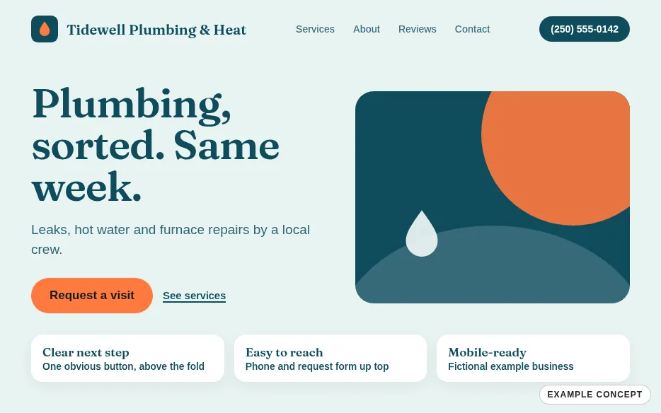
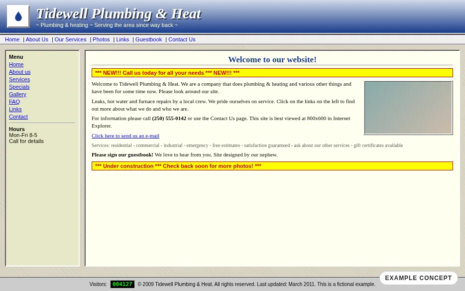
Tidewell Plumbing & Heat · Example concept (fictional business)
All businesses shown are fictional examples. They are not real companies and no real business is featured.
$400flat, CAD
We build a free preview of your new site first. You look at it, and you pay only if you want it. If you don't, you owe nothing.
Get my free previewThe peak-end rule says people remember the best moment and the ending. So the process is built around the moment you see your preview and the moment you go live.
Send a short note about what you do and who you serve. Takes a couple of minutes.
We build a preview of your new site and show it to you. No payment, no pressure.
Look it over, ask for changes, or say no thanks. Either way, you owe nothing for the preview.
Approve it, pay the flat $400, and your site goes live, typically within days of approval.
We're a small Kamloops studio that applies published consumer-psychology research to web design.
We keep asking one question: why do people trust one business within seconds and bounce from another? Published research gives us the vocabulary to answer it, and building sites gives us somewhere to use it.
We're not clinicians, and this is design, not clinical work. We won't promise you numbers. What we can promise is a thoughtful, honest build that you get to see before you pay.
The studio is based in Kamloops and serves Kamloops, Kelowna, Salmon Arm and the BC Interior.
No catch that we know of. We build the preview first. If you like it, the redesign is a flat $400. If you don't, you pay nothing for the preview. We do this because seeing is far more convincing than a sales pitch.
The goal is that you do: your content, your design and your domain. We'll confirm exactly what's handed over, in writing, before you pay anything.
We'll go through hosting and domain options with you plainly before you decide, so there are no surprises after the fact. The $400 is the price of the redesign itself.
Tell us what you'd change, or just say no thanks. You owe nothing for the preview, and there are no hard feelings.
It depends on your business and how quickly we can go back and forth, so we don't want to promise a date. Going live is typically within days of approval.
No one can honestly promise that. What we do is the groundwork: clear page titles and headings, correct local details, fast mobile pages and a tidy Google Business Profile.
Kamloops, BC. We work with businesses across Kamloops, Kelowna, Salmon Arm and the BC Interior, mostly online.
No. There are no tracking cookies or analytics scripts on this site. The experiments run entirely in your browser, and your lab notebook progress is stored only on this device, in your browser, until you reset it.
Tell us a little about your business. There's nothing to pay to see the preview, and the flat $400 only comes into it if you love the result.
Plumbing, sorted. Same week.
Local and easy to reach.
Request a visitWelcome to our website
We are a company that does plumbing and other things and has done so for a while with certifications and many values and a mission statement that you can read below if you wish to do so.
Get a quoteClick hereFree e-bookNEWS & SPECIALS
Tip of the week. Winter hours. Spring hours. Gift cards. Newsletter. Contact us today. Contact us today.
Subscribe!